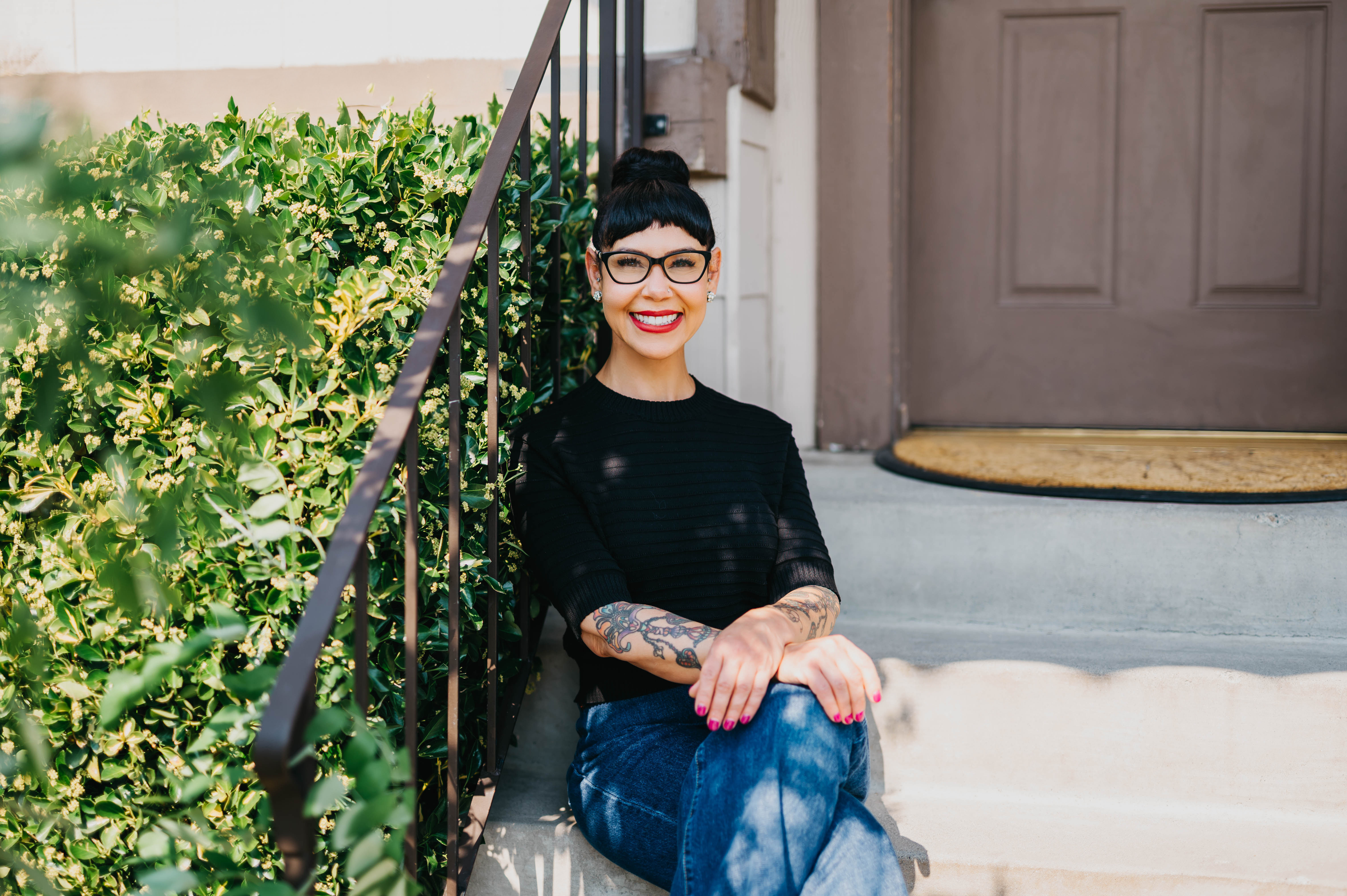
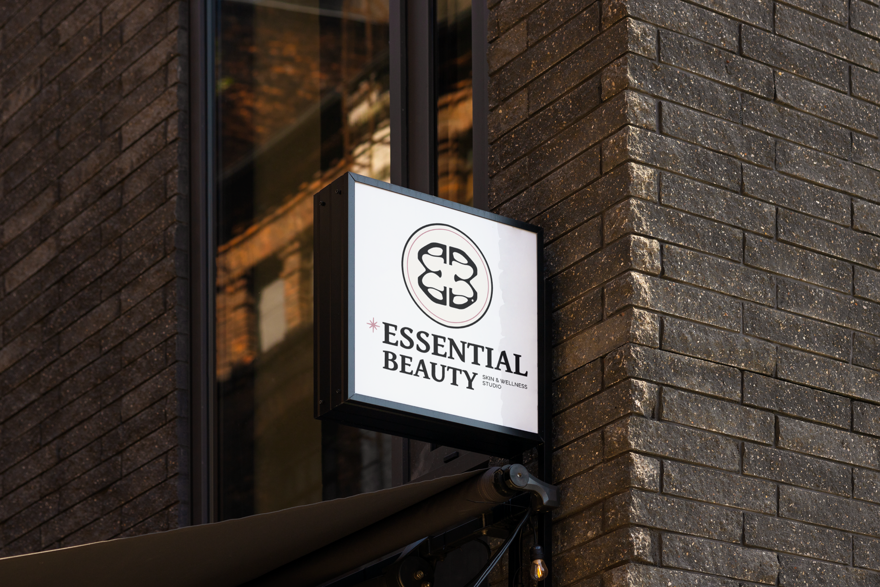
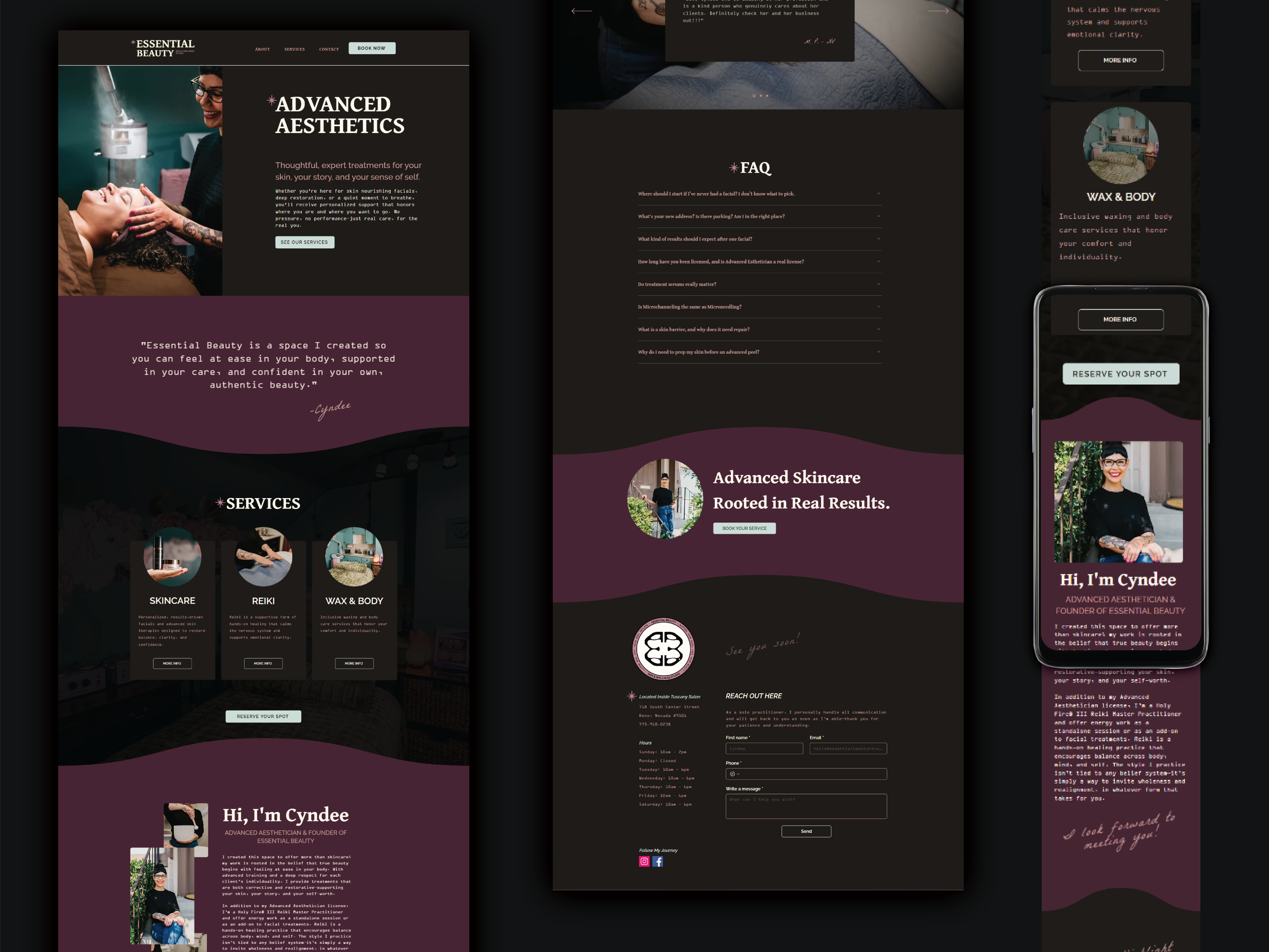
The original brand felt flat, forgettable, and at odds with the business's actual strengths. The founder didn’t see herself in the visuals or language, and clients weren’t connecting. A clunky website and generic aesthetic left her feeling at odds with her brand.
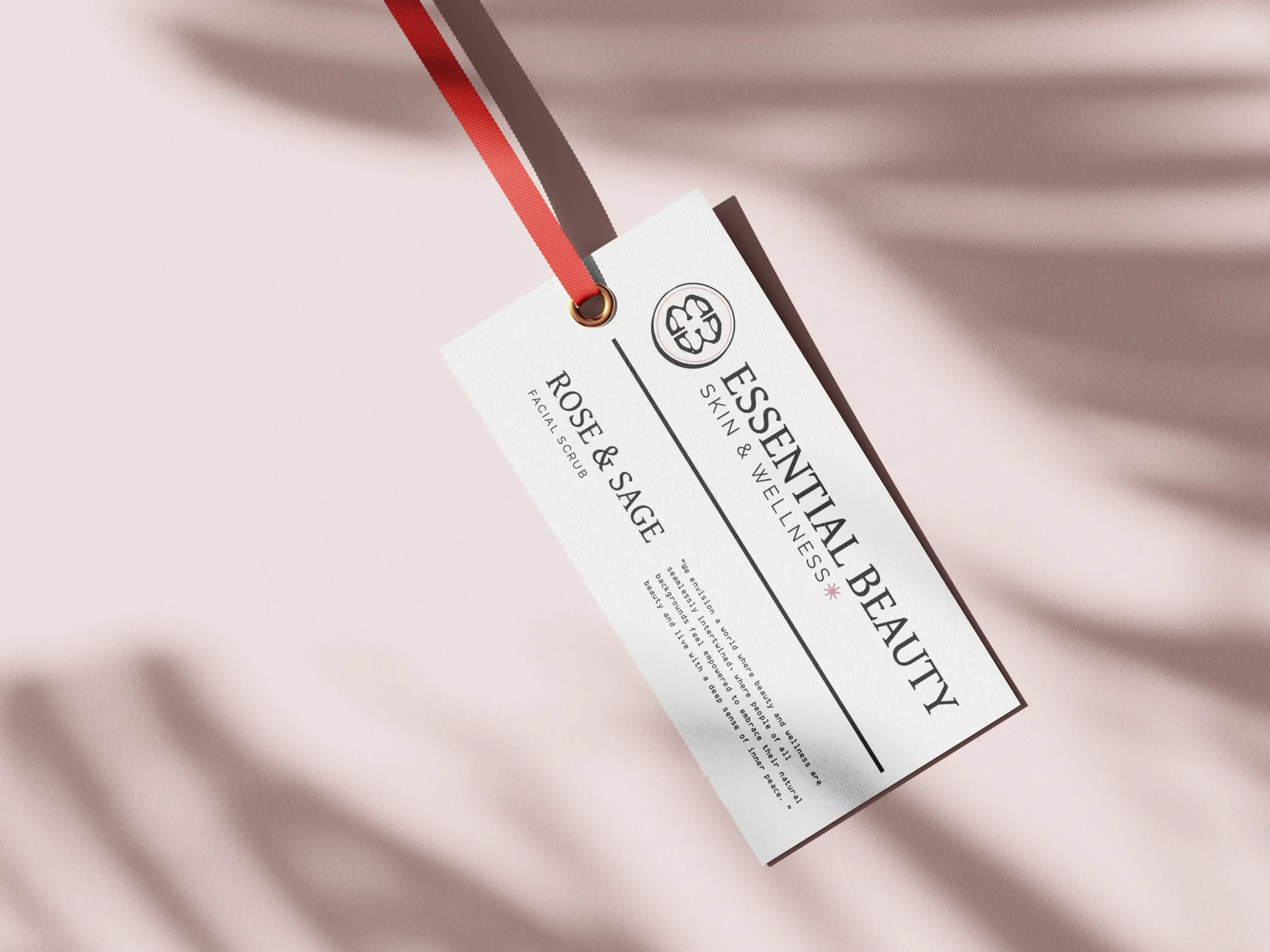
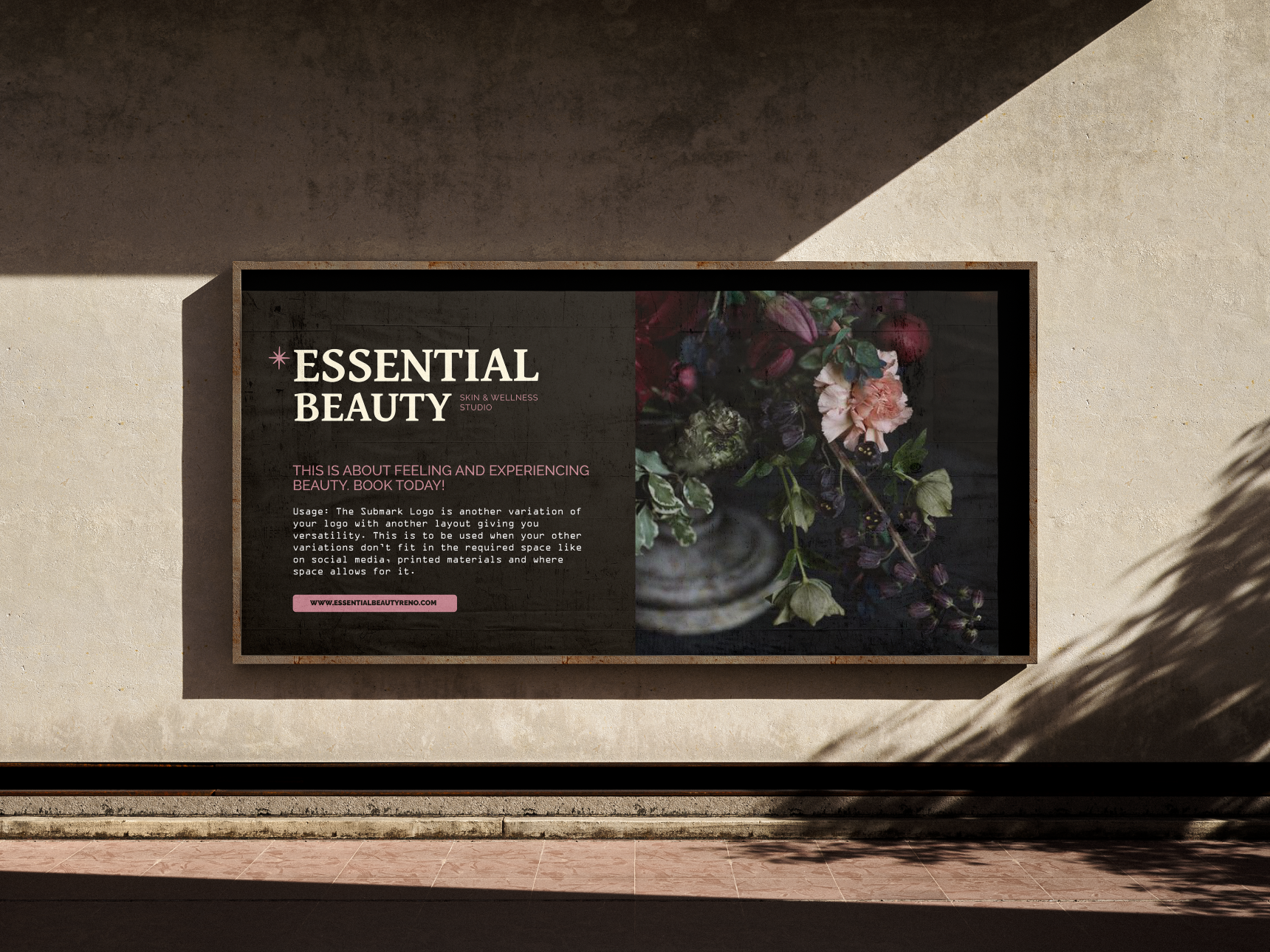
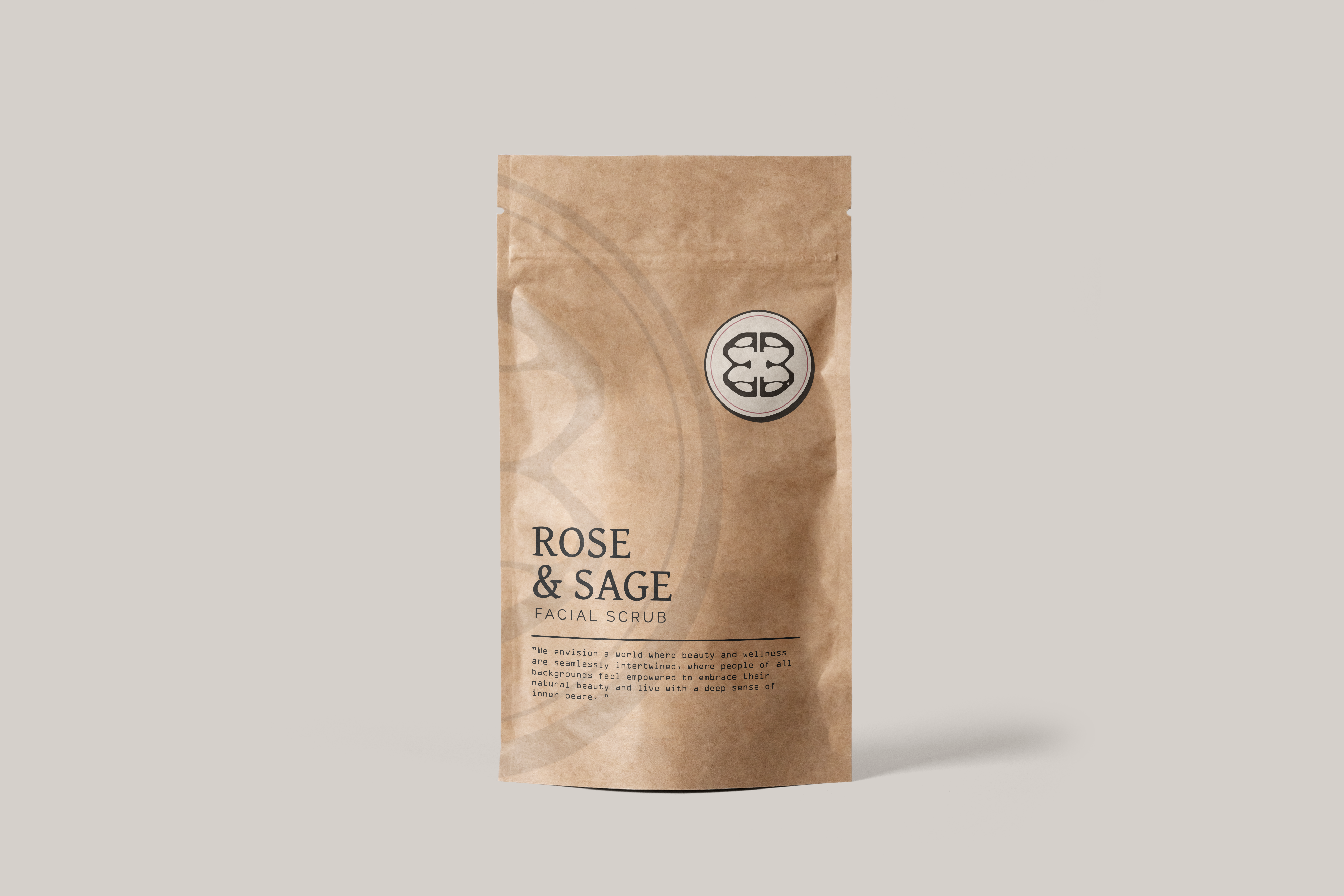
We were inspired by 1930s glam, art nouveau, and the clinical precision of her work — a blend of elegance and intellect. The goal was to infuse rich color and artistic shapes without losing the nerdiness that comes from her love of science. We also looked at brands she admired and cross-referenced them with what was already being marketed to her audience, making sure the final direction felt both distinct and strategic.
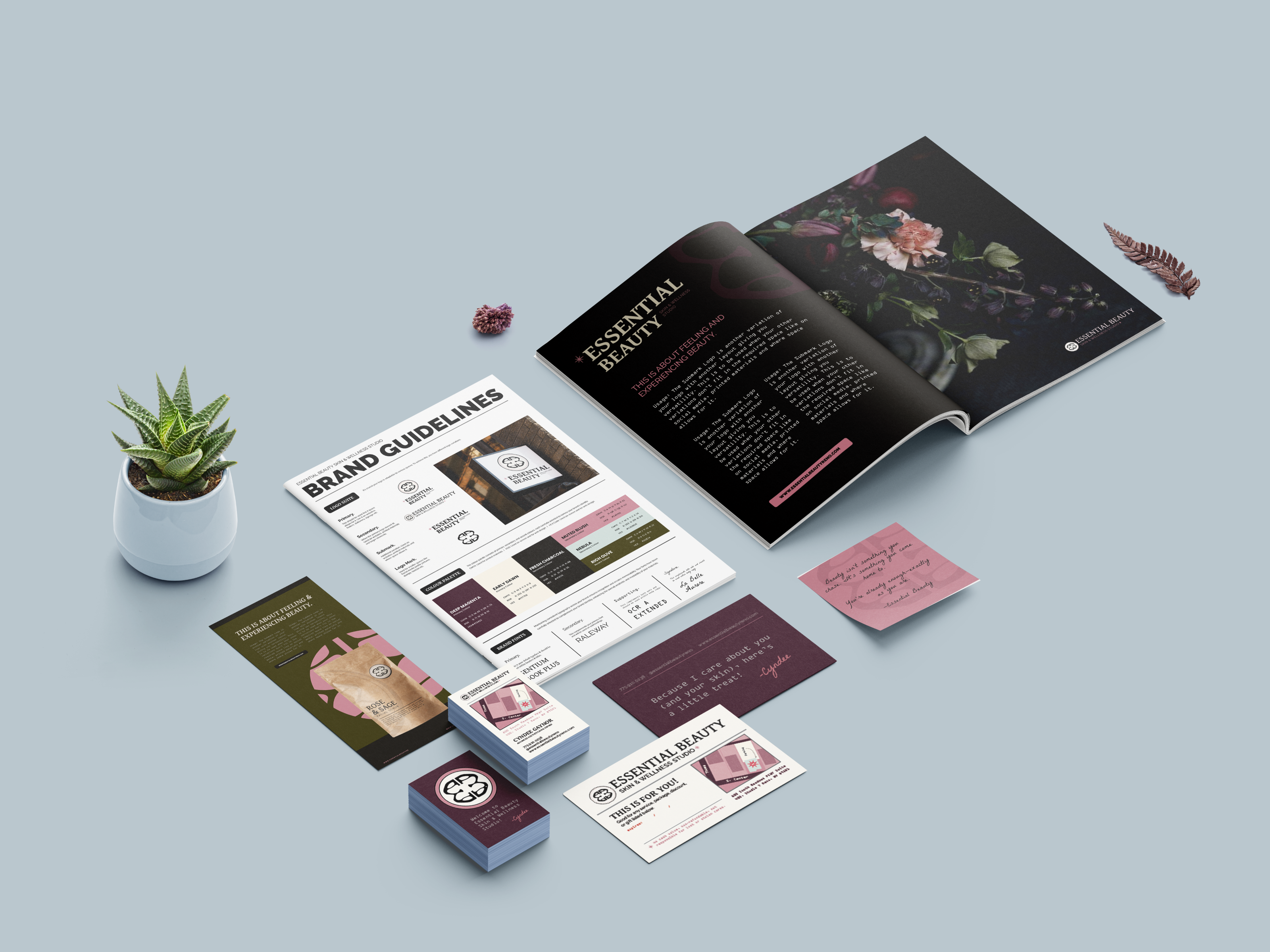
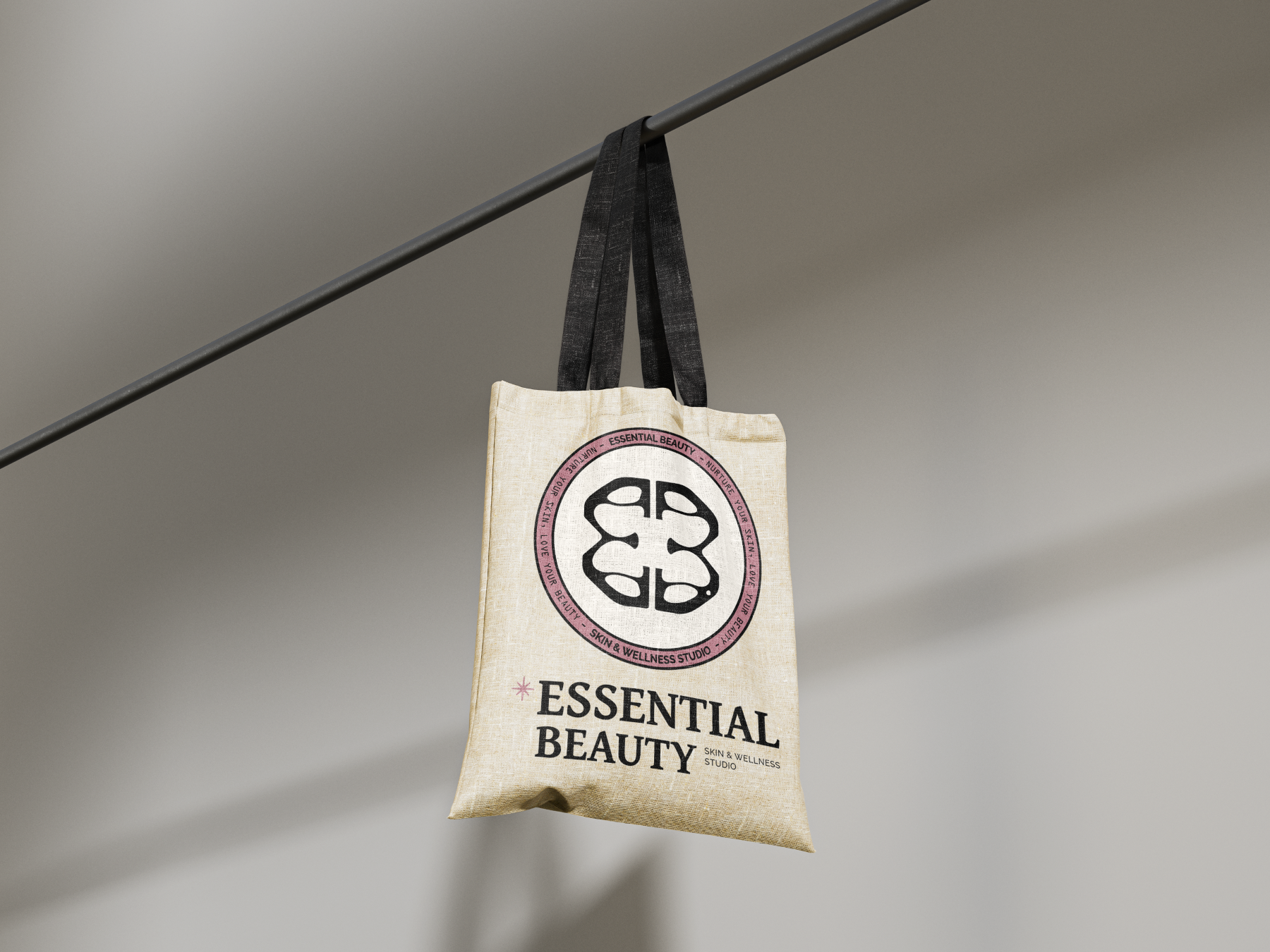
The rebrand didn’t just change how her business looks. It changed how it operates. With a visual identity that finally feels like her, the client has realigned everything from her product names to her physical space. She’s restructured her marketing goals, refined her offerings, and stepped into promotion with clarity and confidence. What once felt disjointed now feels intentional. The brand gave her not just a new look, but a system that reflects her values: scientific, stylish, and deeply human across every touchpoint.
"Working with Rachael has been integral to building my brand. She listened to and captured all the ideas, hopes, visions, and the essence of me, then narrowed all of it into my brand. Rachael’s work ethic and integrity is phenomenal, and it comes through in her work. She made sure the design was a beautiful and accurate representation of me and my business. She is a master at her craft. I would not work with anyone else to build the brand that will carry me and my business forward."
"Rachael helped bring a brand and authority to my business. My website generates a large number of leads and consistent referrals. Rachael’s creative design and deep passion for her craft make her, in my mind, the go-to choice when it comes to website development and branding. Don’t think twice, you’ll regret it :)"
"Working with Rachael and 42 Titan Design has been nothing short of incredible and amazing. I gave her all of my ideas, wants and needs (in a mind cluster) for my website and she was so attuned with how it was me and represented me so well. She goes above and beyond for her clients and also takes the time to make sure that you truly love what she has come up with. I go to her with all of my questions and problems as I am not tech savvy and would and will continue to reach out to her for each change or want I need for my business. I will and do refer all people to her that have ideas but need guidance with making it fit perfectly for them. Thank you so much Rachael for all that you do and for being such an incredible human!!!"