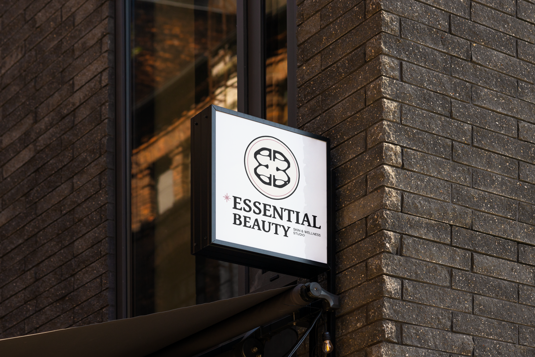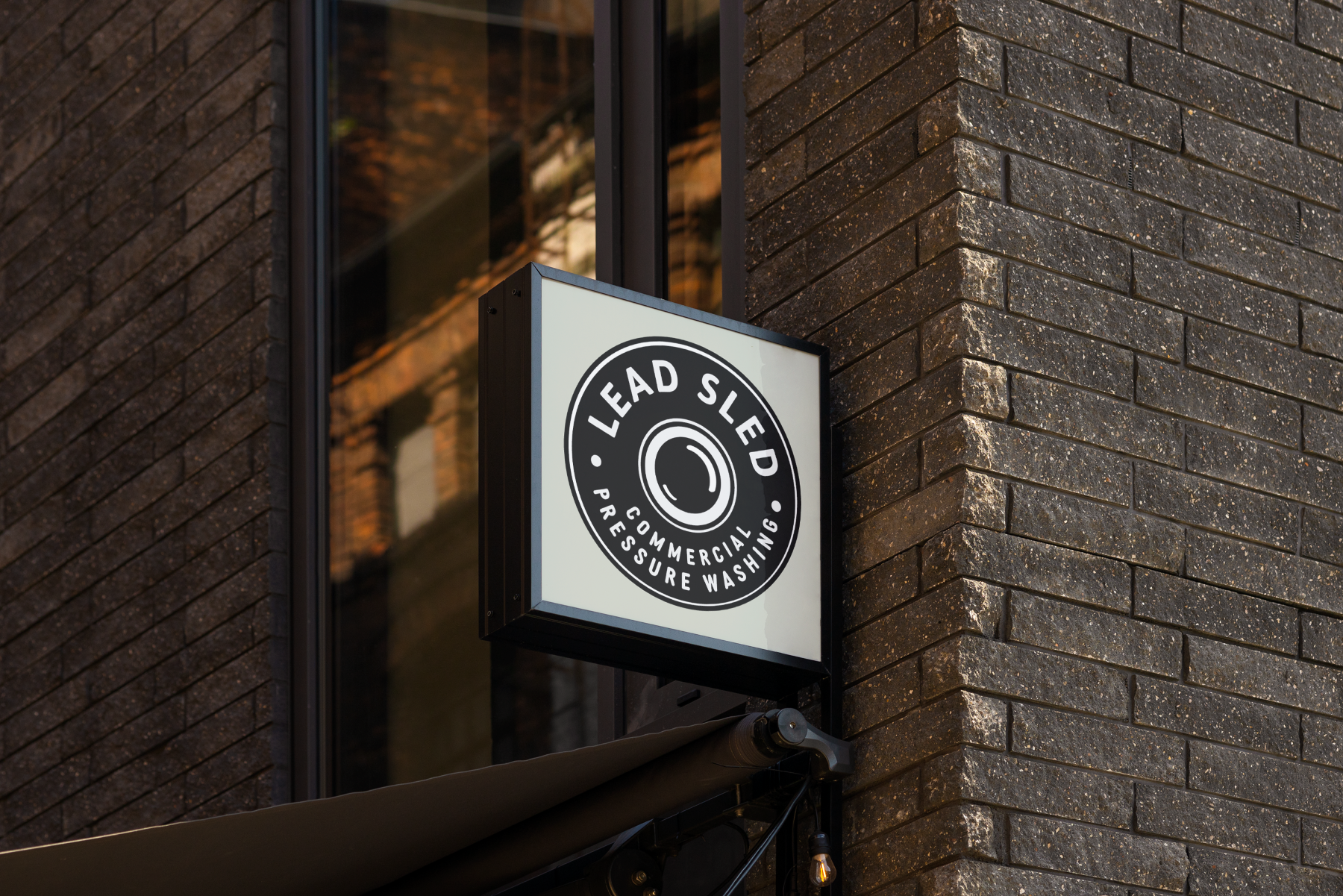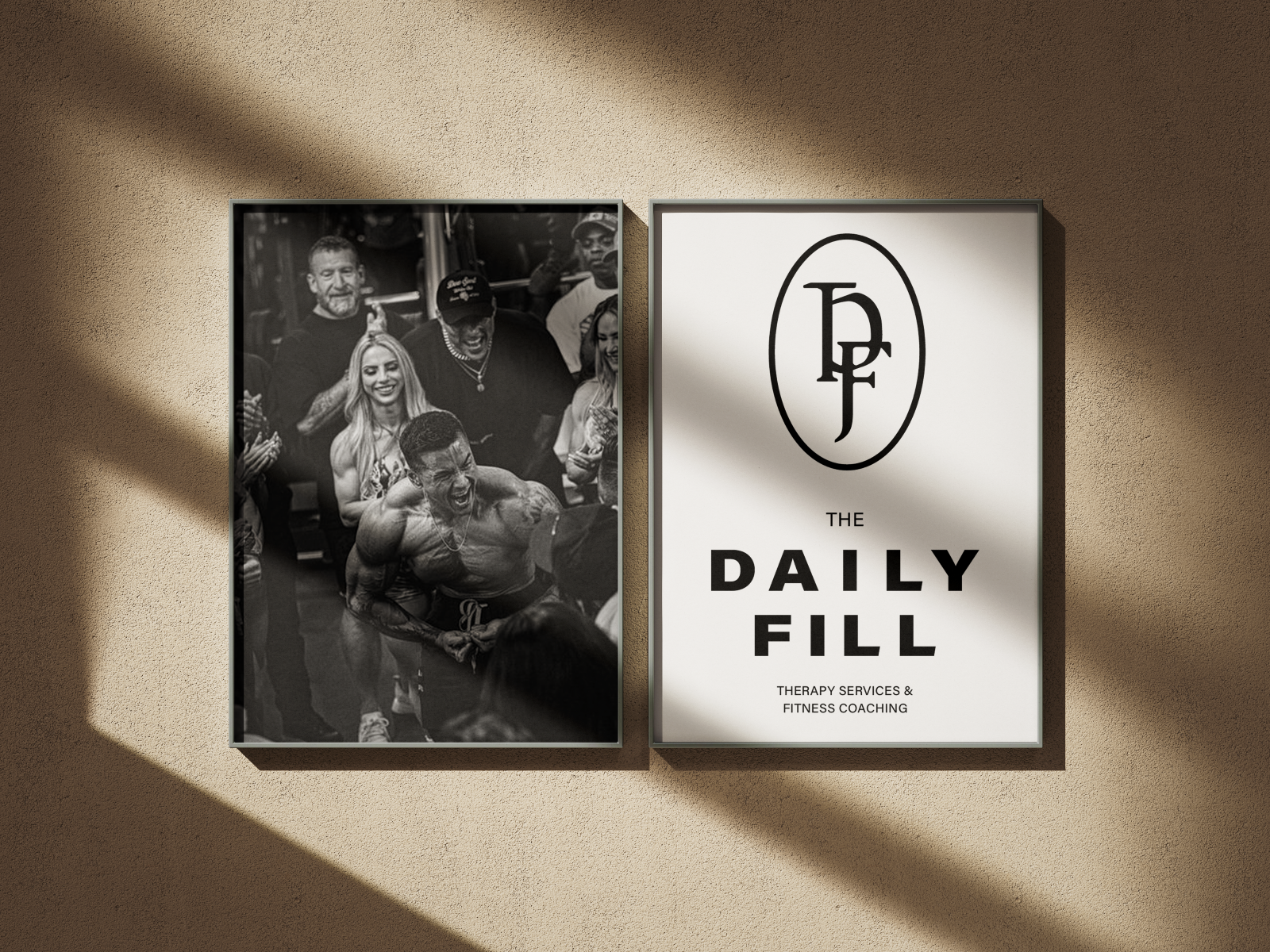
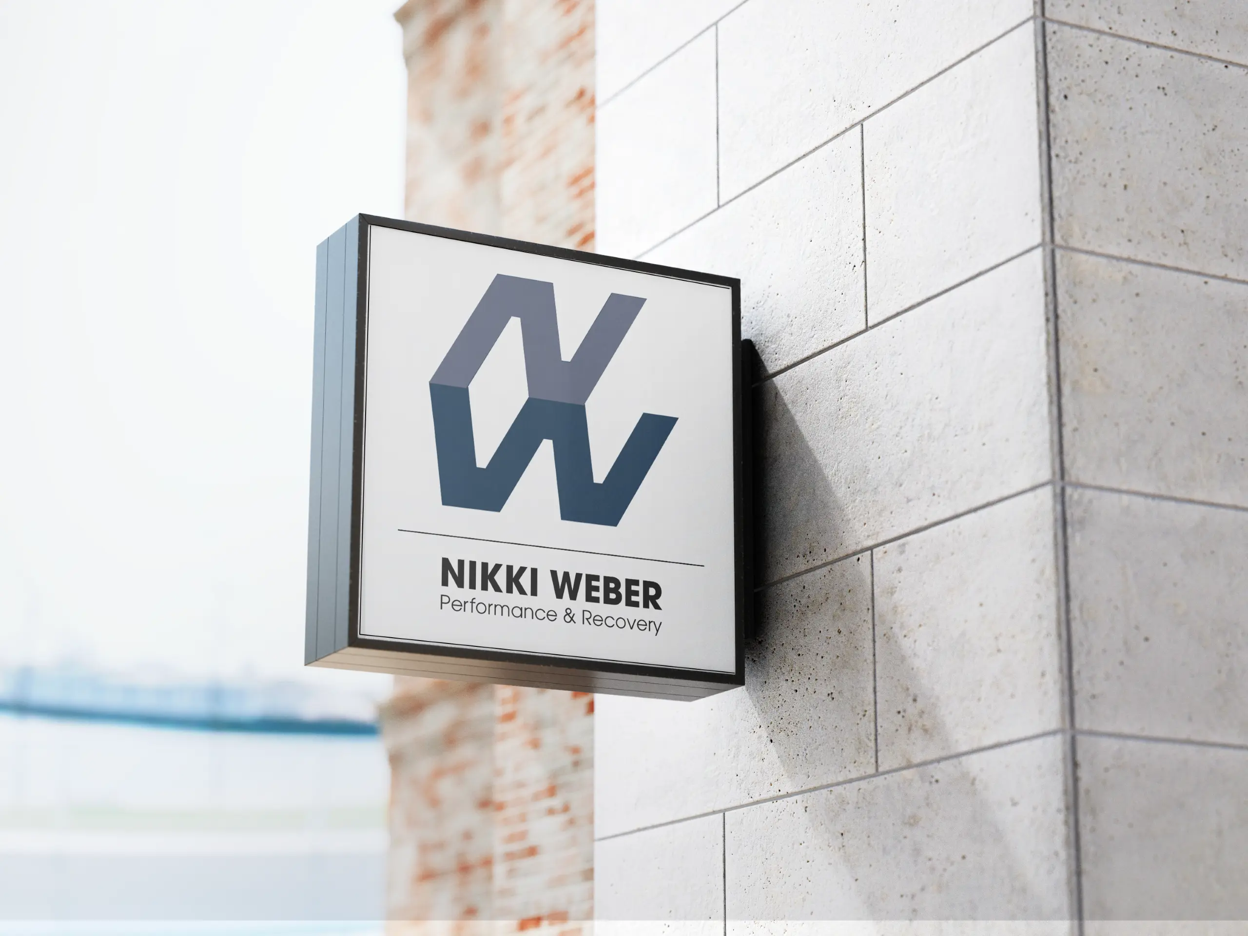
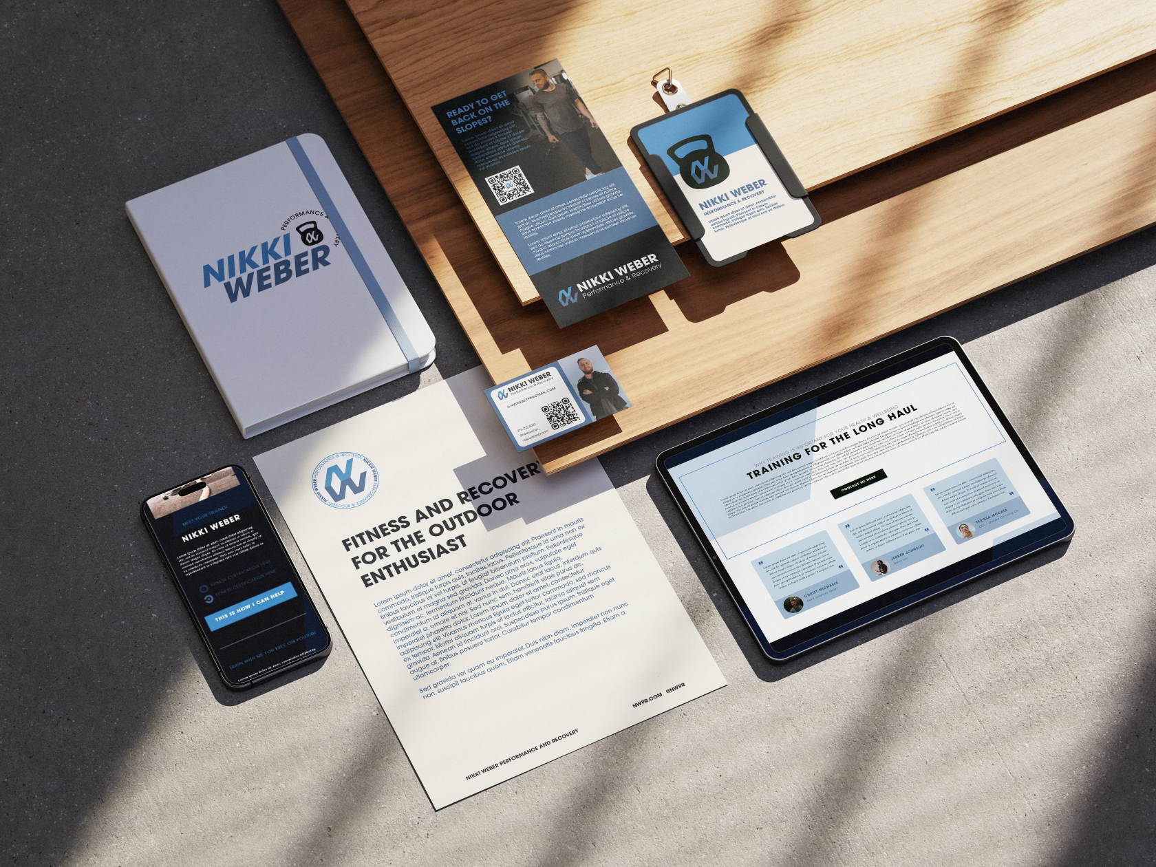
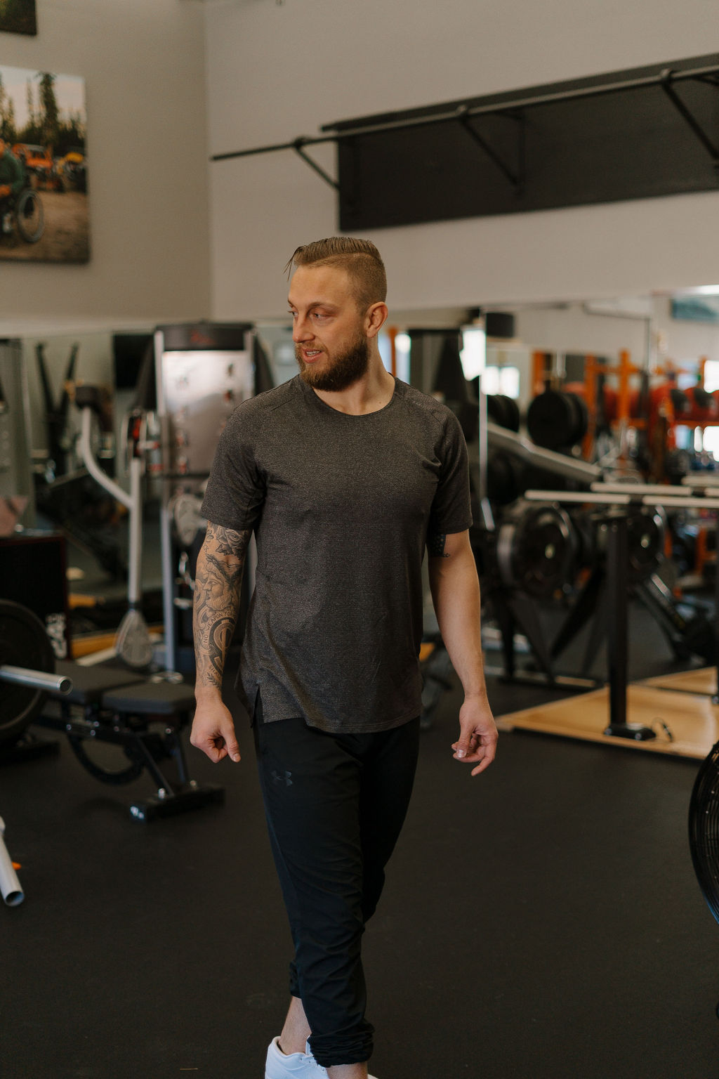
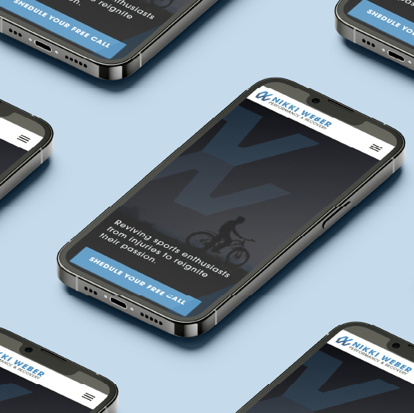
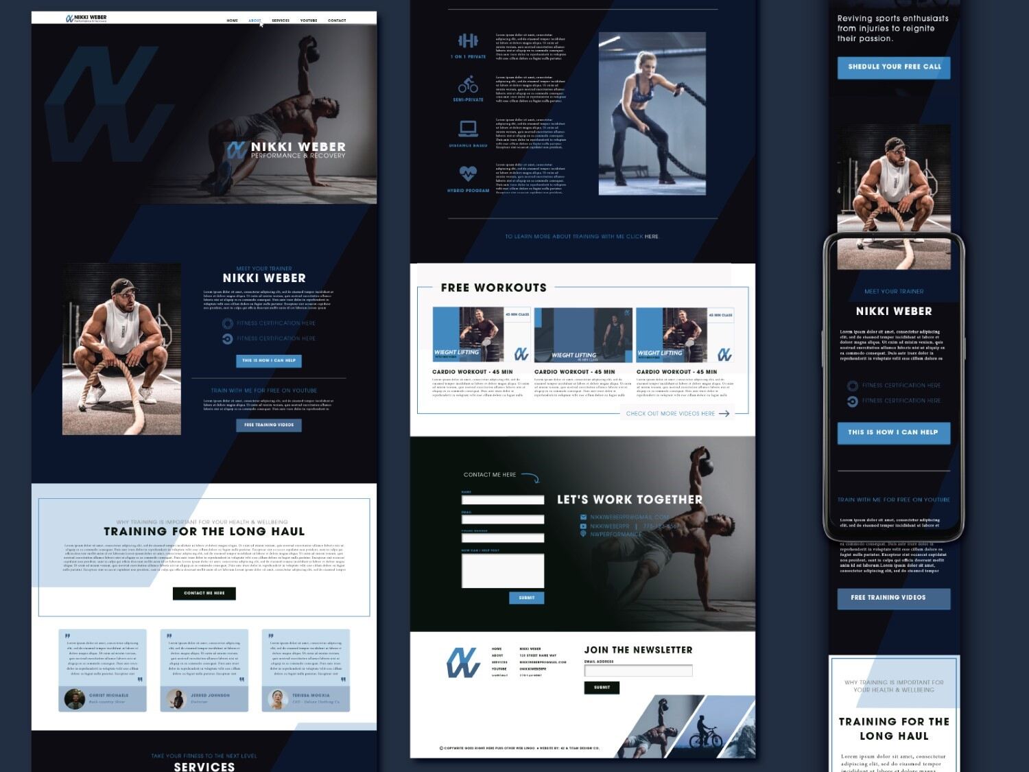
The client wanted to avoid anything overly flashy or decorative. He needed a brand that communicated professionalism, control, and capability while maintaining a grounded presence. The visuals had to reflect his focused mindset and structured process, while still being inviting to new clients.
We began by identifying the tone: cool, clear, and composed which is a reflection of Nikki’s direct yet grounded approach to recovery. From there, we looked outward, studying corporate identities, direct competitors, and brands already speaking to her target audience. By cross-referencing monochromatic palettes and structured design systems, we created a brand that feels familiar and professional, without blending in.
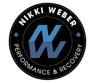
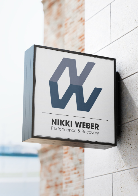
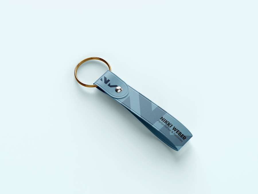
The final brand captures Nikki’s clear, confident presence and gives him the tools to show up consistently across every touchpoint, from digital platforms to physical materials. The sharp logo suite and minimal design communicate structure, trust, and professionalism at a glance. It’s a brand that performs with clarity and intention, designed to support a focused, steady approach.
.jpg)
"Rachael helped bring a brand and authority to my business. My website generates a large number of leads and consistent referrals. Rachael’s creative design and deep passion for her craft make her, in my mind, the go-to choice when it comes to website development and branding. Don’t think twice, you’ll regret it :)"
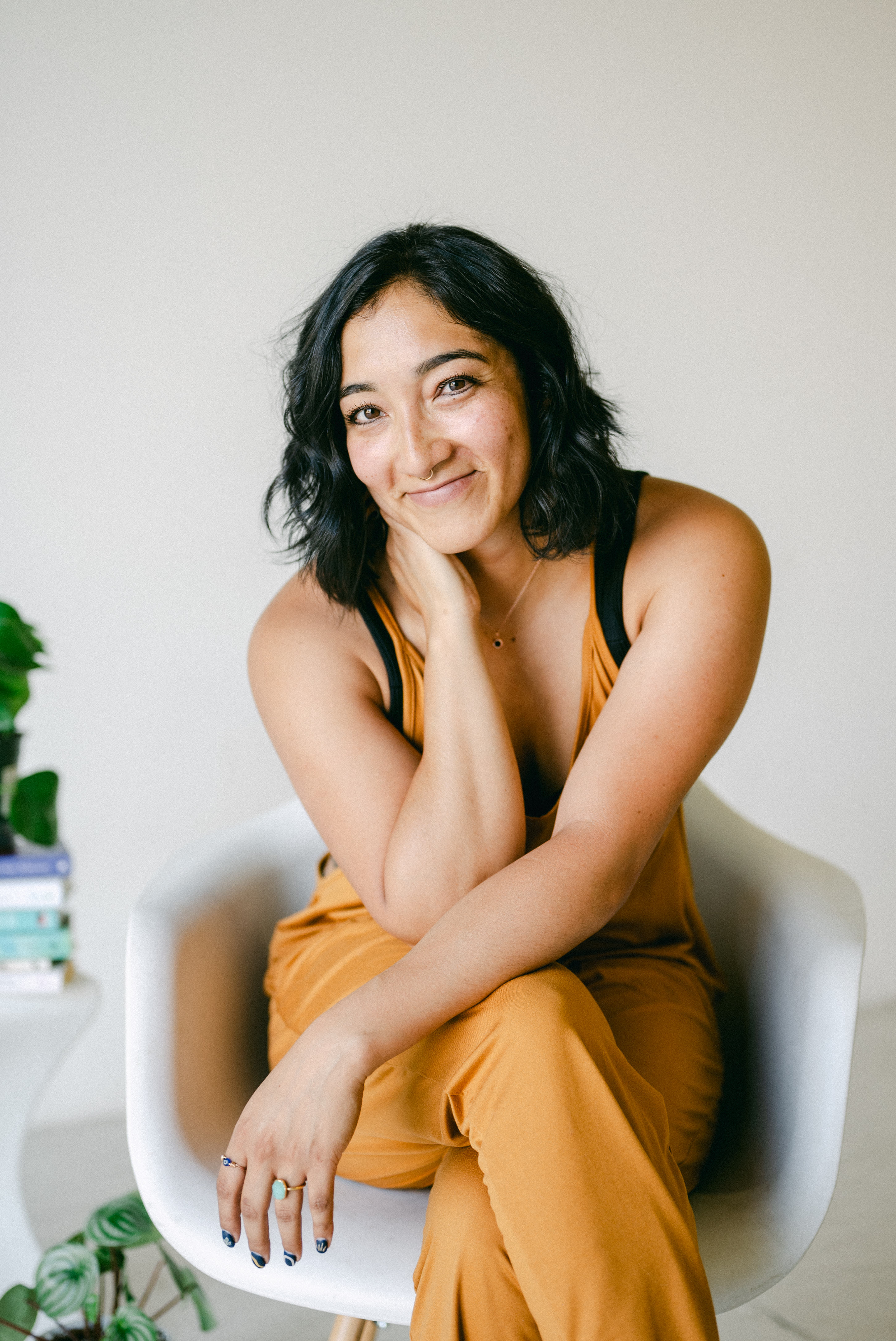
"Working with Rachael has been integral to building my brand. She listened to and captured all the ideas, hopes, visions, and the essence of me, then narrowed all of it into my brand. Rachael’s work ethic and integrity is phenomenal, and it comes through in her work. She made sure the design was a beautiful and accurate representation of me and my business. She is a master at her craft. I would not work with anyone else to build the brand that will carry me and my business forward."
"Rachael helped bring a brand and authority to my business. My website generates a large number of leads and consistent referrals. Rachael’s creative design and deep passion for her craft make her, in my mind, the go-to choice when it comes to website development and branding. Don’t think twice, you’ll regret it :)"
"Working with Rachael and 42 Titan Design has been nothing short of incredible and amazing. I gave her all of my ideas, wants and needs (in a mind cluster) for my website and she was so attuned with how it was me and represented me so well. She goes above and beyond for her clients and also takes the time to make sure that you truly love what she has come up with. I go to her with all of my questions and problems as I am not tech savvy and would and will continue to reach out to her for each change or want I need for my business. I will and do refer all people to her that have ideas but need guidance with making it fit perfectly for them. Thank you so much Rachael for all that you do and for being such an incredible human!!!"