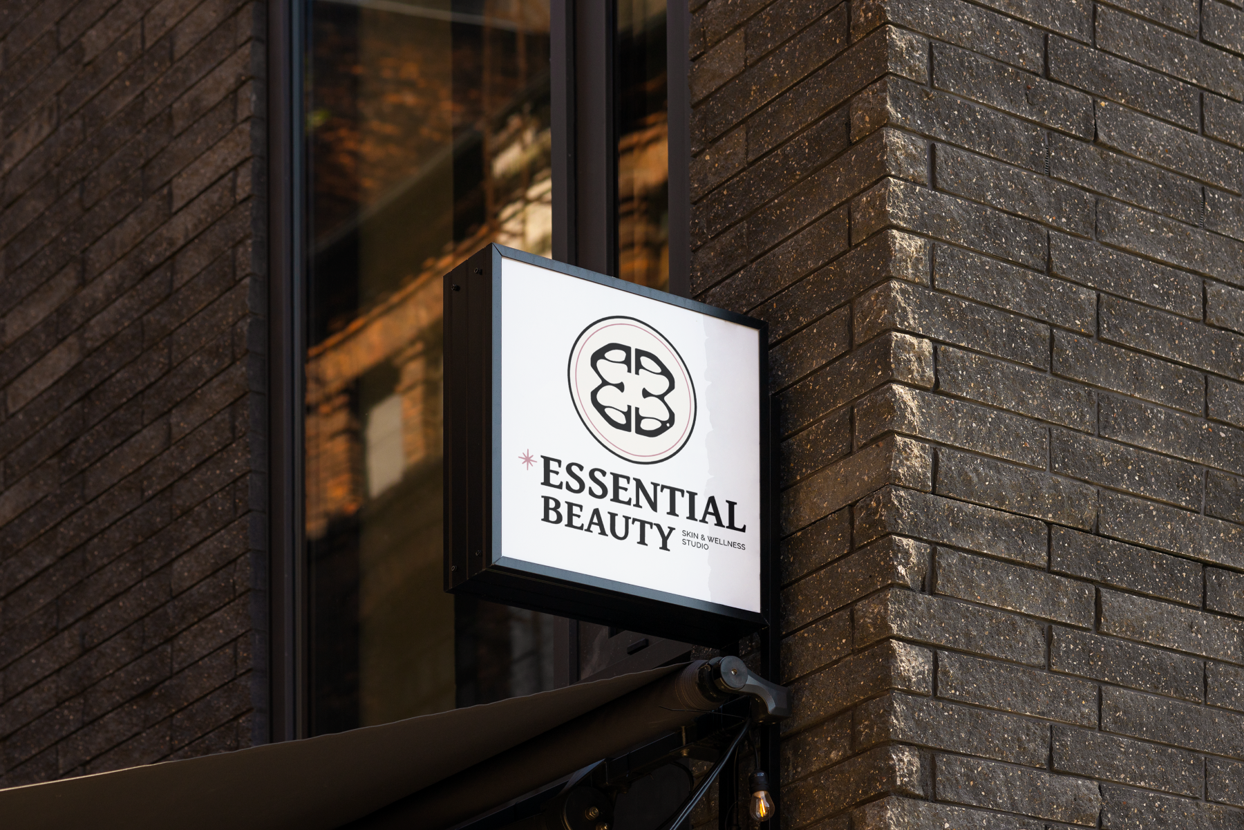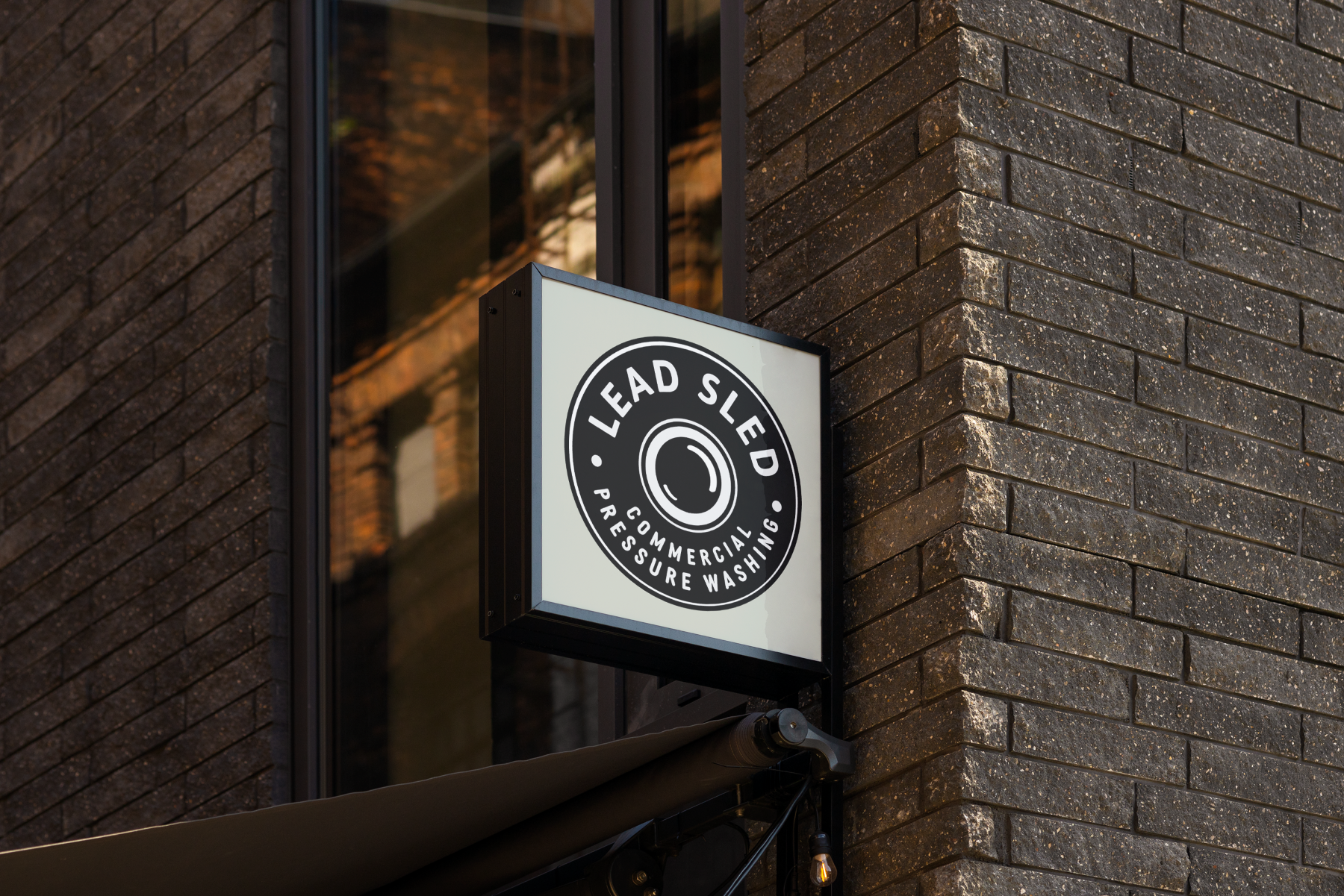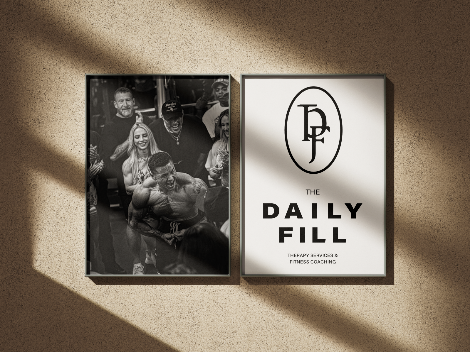
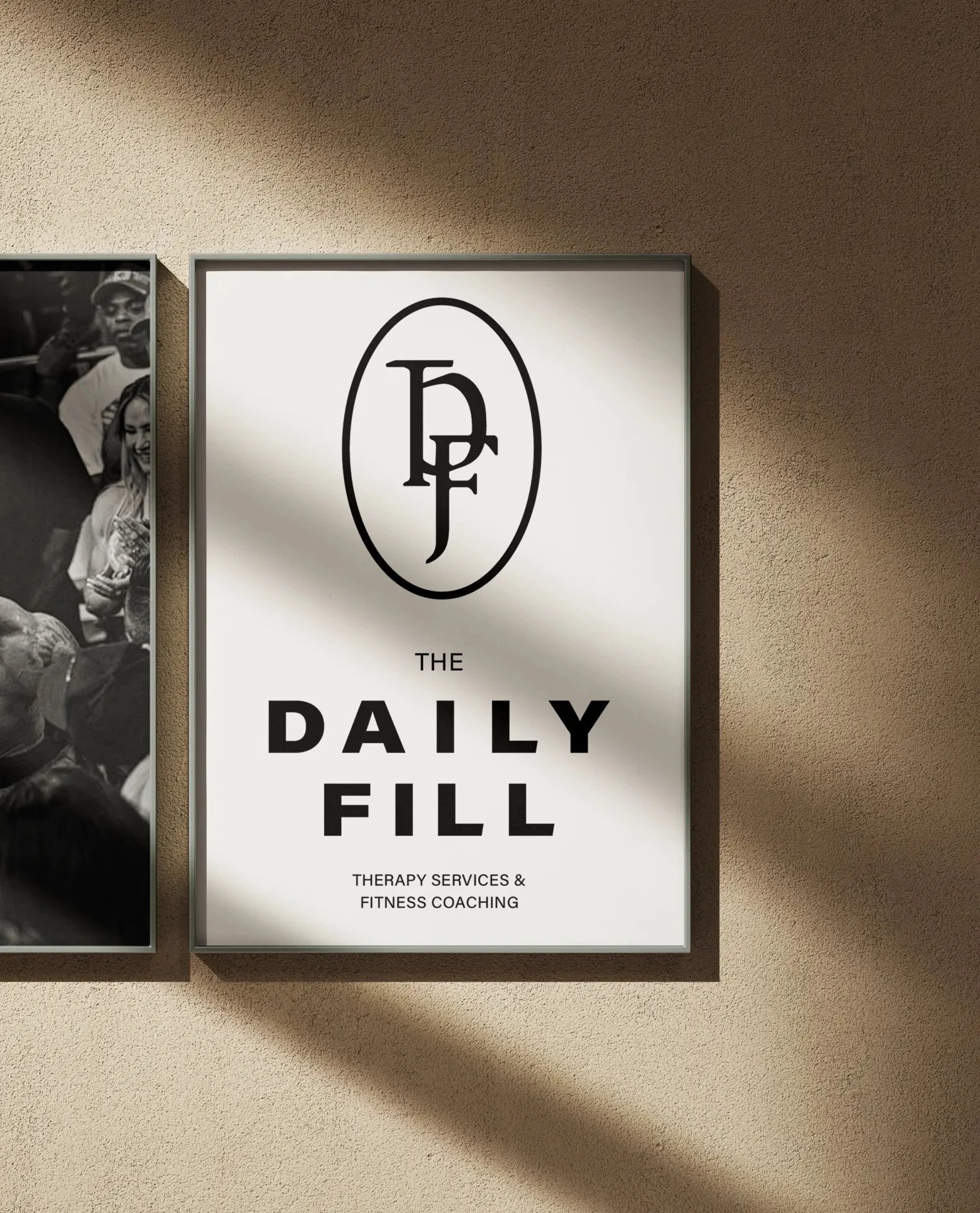
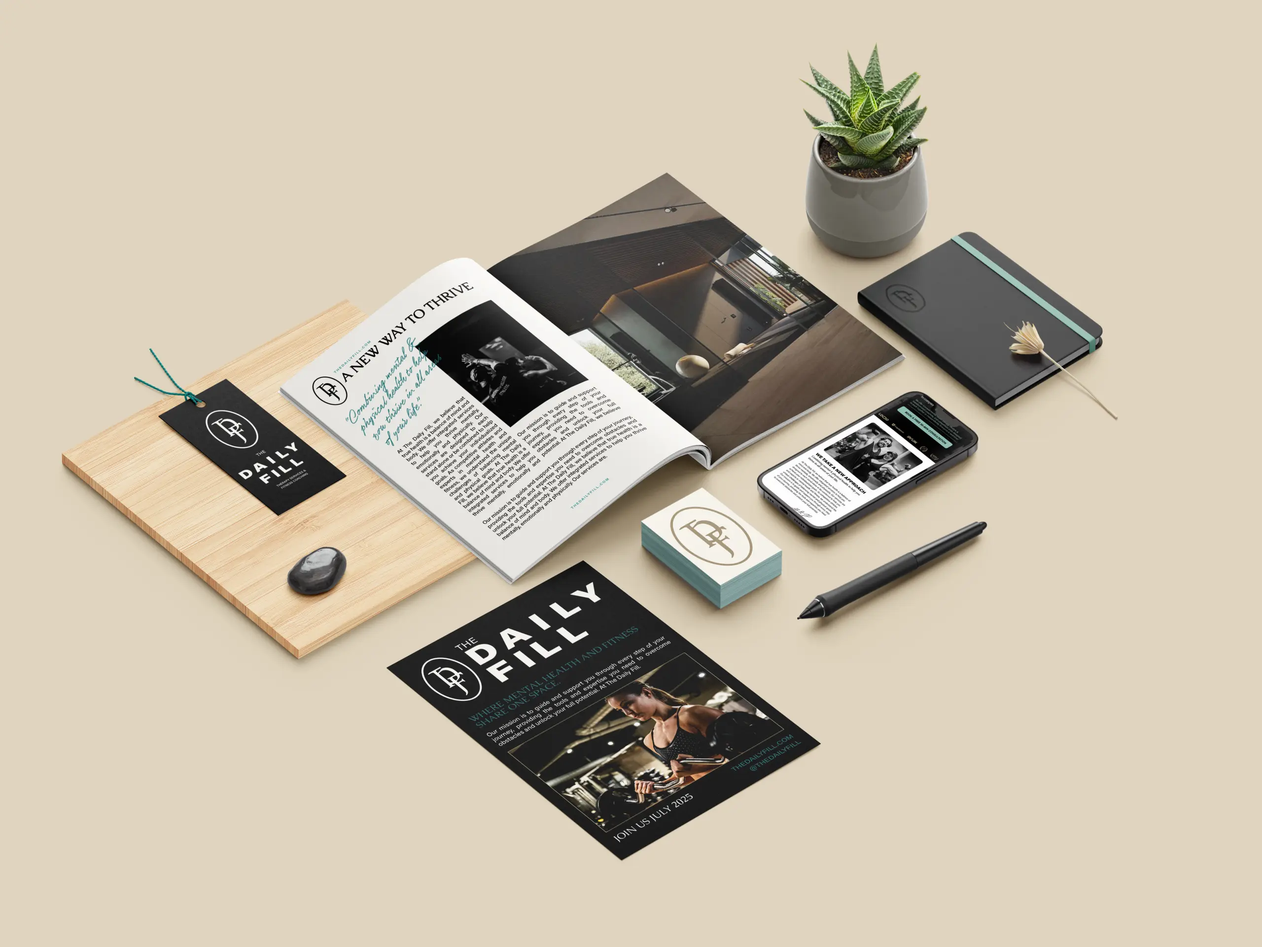
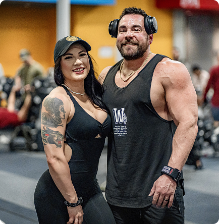
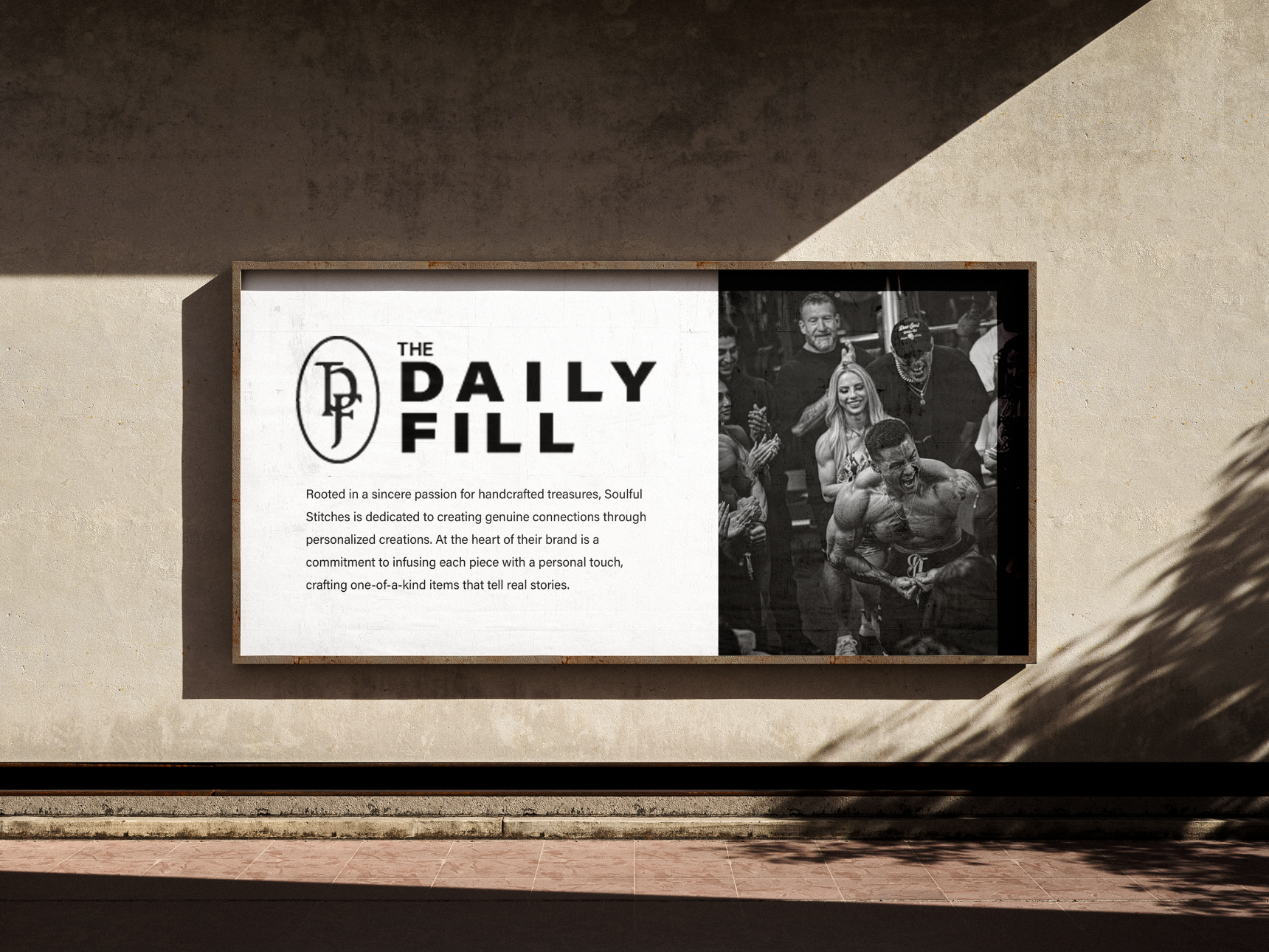
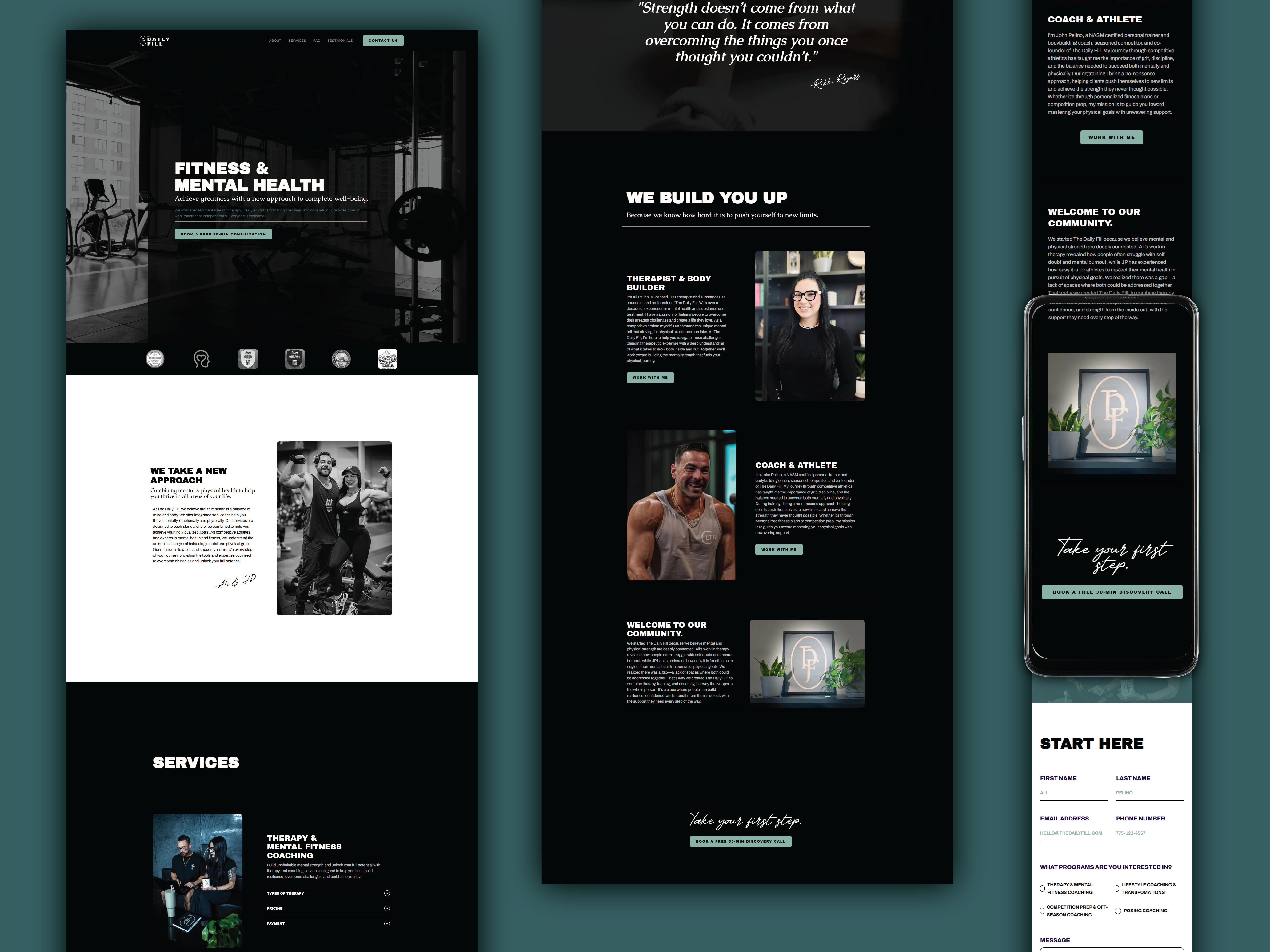
Creating a brand for The Daily Fill meant bridging two distinct communities. Therapy and fitness often live in separate spaces, and their branding rarely overlaps. The clients wanted a gritty, high-impact feel that wouldn’t alienate therapy clients, and a grounded, emotionally intelligent approach that still honored the strength and motivation at the core of fitness culture. The business model was also new and multifaceted, so clarity and cohesion were essential from the start.
We started with a deep strategy session to understand the full scope of the client’s vision and the space where performance and wellness intersect. From there, we explored how fitness and therapy brands typically communicate, mapping where their visual languages conflict and where they could align. Through mood boarding, audience research, and collaborative feedback, we shaped a direction that felt grounded, motivating, and emotionally intelligent. Contrast became a core design principle by balancing elegance with grit and pairing warmth with structure. The result is a brand built to show up across contexts with clarity and confidence, whether someone is stepping into the gym or into therapy.
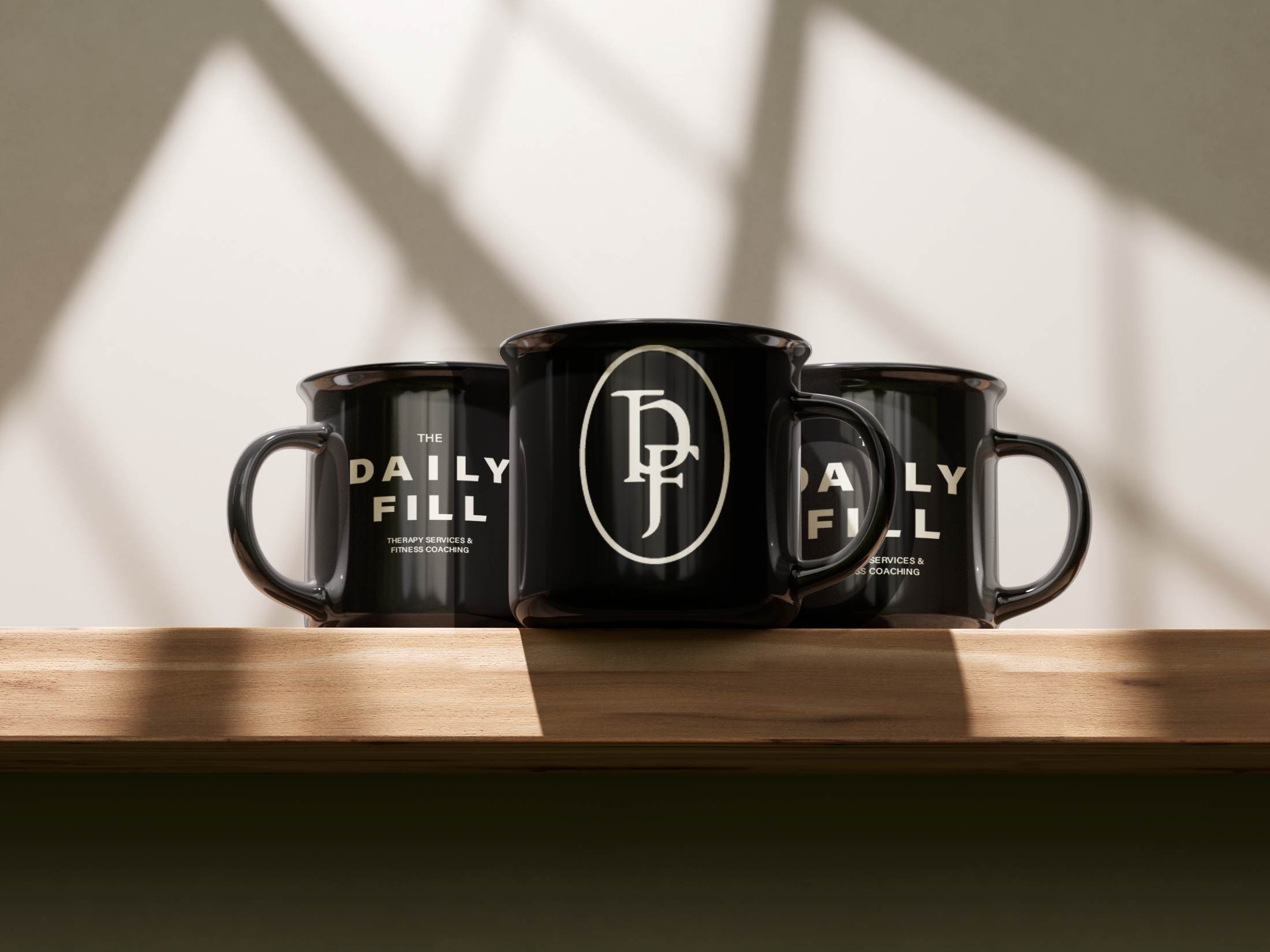
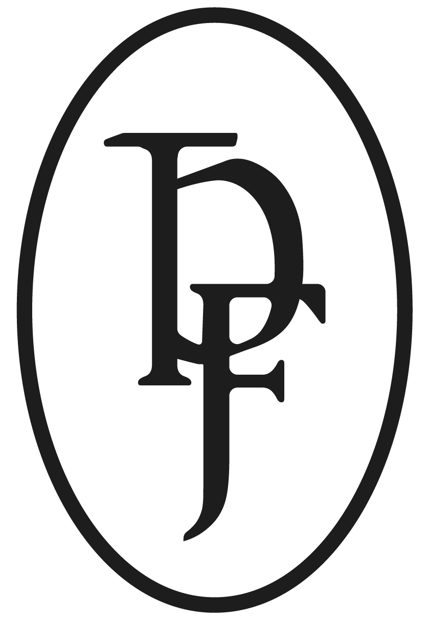
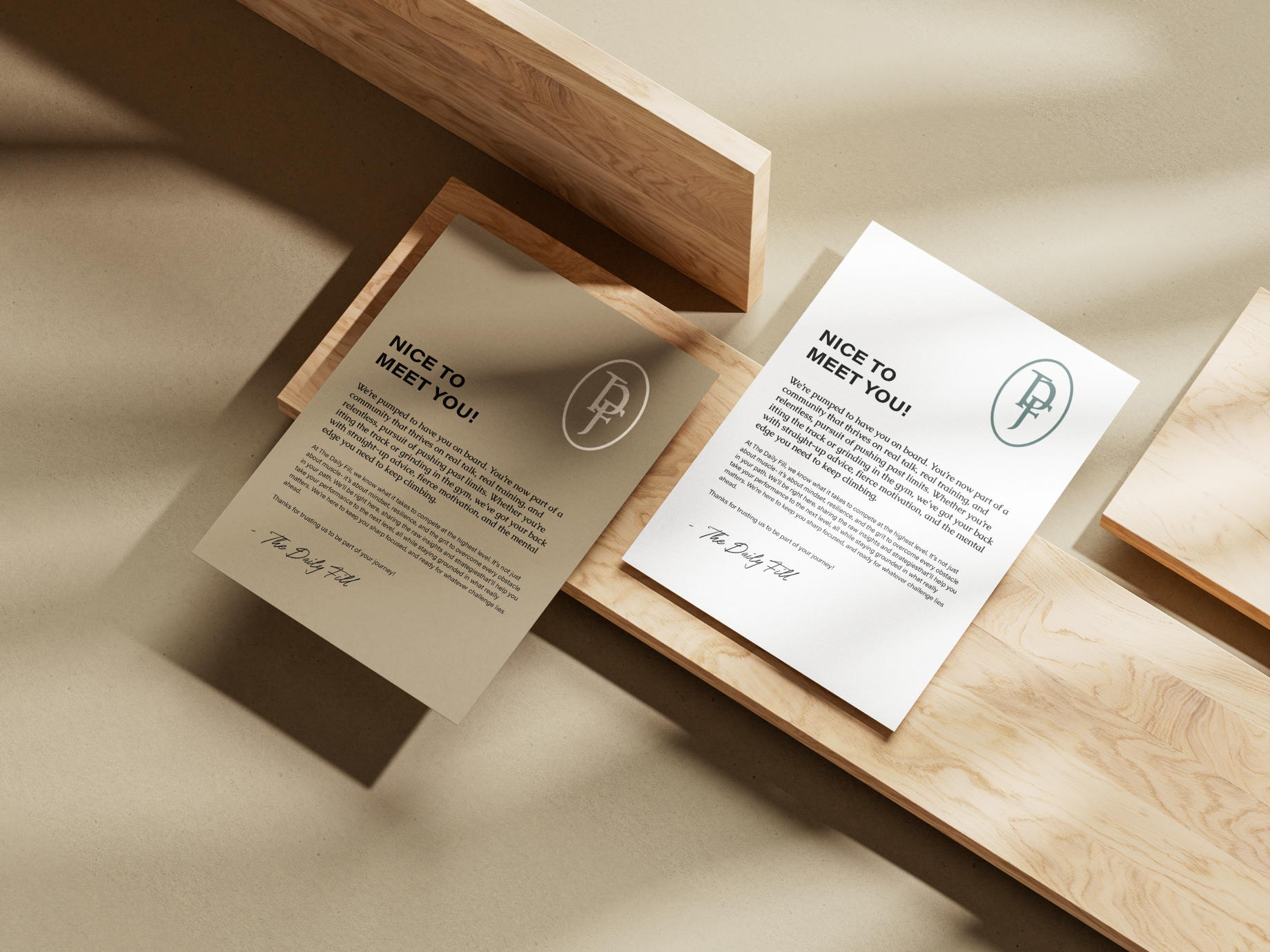
The final brand reflects The Daily Fill’s full vision; bold, grounded, and built to hold both strength and vulnerability. It invites athletes and therapy-seekers into a space where performance and care are not in conflict but part of the same growth. The visual identity is clean and impactful, with just enough edge to stand out while staying rooted in clarity and trust. The result is a brand that feels authentic to the founders and flexible enough to grow alongside their work.
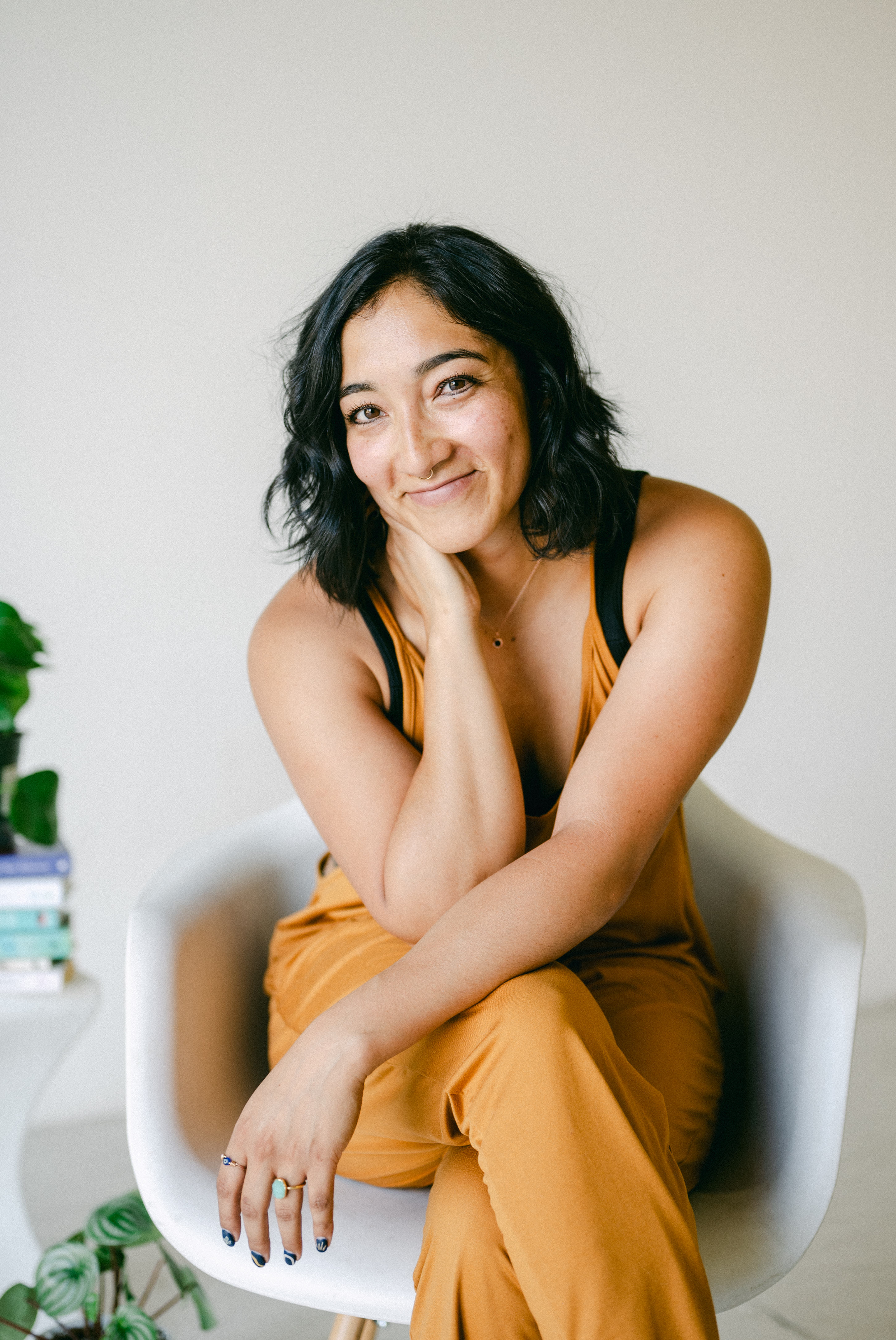
"Working with Rachael has been integral to building my brand. She listened to and captured all the ideas, hopes, visions, and the essence of me, then narrowed all of it into my brand. Rachael’s work ethic and integrity is phenomenal, and it comes through in her work. She made sure the design was a beautiful and accurate representation of me and my business. She is a master at her craft. I would not work with anyone else to build the brand that will carry me and my business forward."
"Rachael helped bring a brand and authority to my business. My website generates a large number of leads and consistent referrals. Rachael’s creative design and deep passion for her craft make her, in my mind, the go-to choice when it comes to website development and branding. Don’t think twice, you’ll regret it :)"
"Working with Rachael and 42 Titan Design has been nothing short of incredible and amazing. I gave her all of my ideas, wants and needs (in a mind cluster) for my website and she was so attuned with how it was me and represented me so well. She goes above and beyond for her clients and also takes the time to make sure that you truly love what she has come up with. I go to her with all of my questions and problems as I am not tech savvy and would and will continue to reach out to her for each change or want I need for my business. I will and do refer all people to her that have ideas but need guidance with making it fit perfectly for them. Thank you so much Rachael for all that you do and for being such an incredible human!!!"